
Location ONE:
This location needs to be plain and simple to go with all the coverlines and the large masthead on the cover. The background needs to be close to the pink, blue and purple used on the cover. An alternative to this would be use photoshop to edit out the background and use just the outline of the model on the front cover.
Location TWO:
This location will be the location used for the picture on my double page spread. The location needs to be bright so I can take a good high quality photography to cover the whole one page of the double page spread. For the photograph the costume of the character will be more important than the location but still needs to fit in with the character.

Church gardens: This location would be a very good setting for the pictures as it is very busy and there is lots to look at. However, it would not be suitable for a young teenagers music magazine as it doesn't really go with the 'Lily-Emma' character and younger teenagers would not really be attracted to a dull and scary graveyard area with a church in the background.

Garden bench: This would be a good place to take the pictures as there are many ways the model could be positioned. One particular way I would like to try is for Lily-Emma to be standing on the bench. This would be good photograph wise so I would get a long-shot of her. But also as to represent her character as a teenage girl is doesn't necessarily go with the correct thing to do and looks a little bit rebelious standing on benches for example.
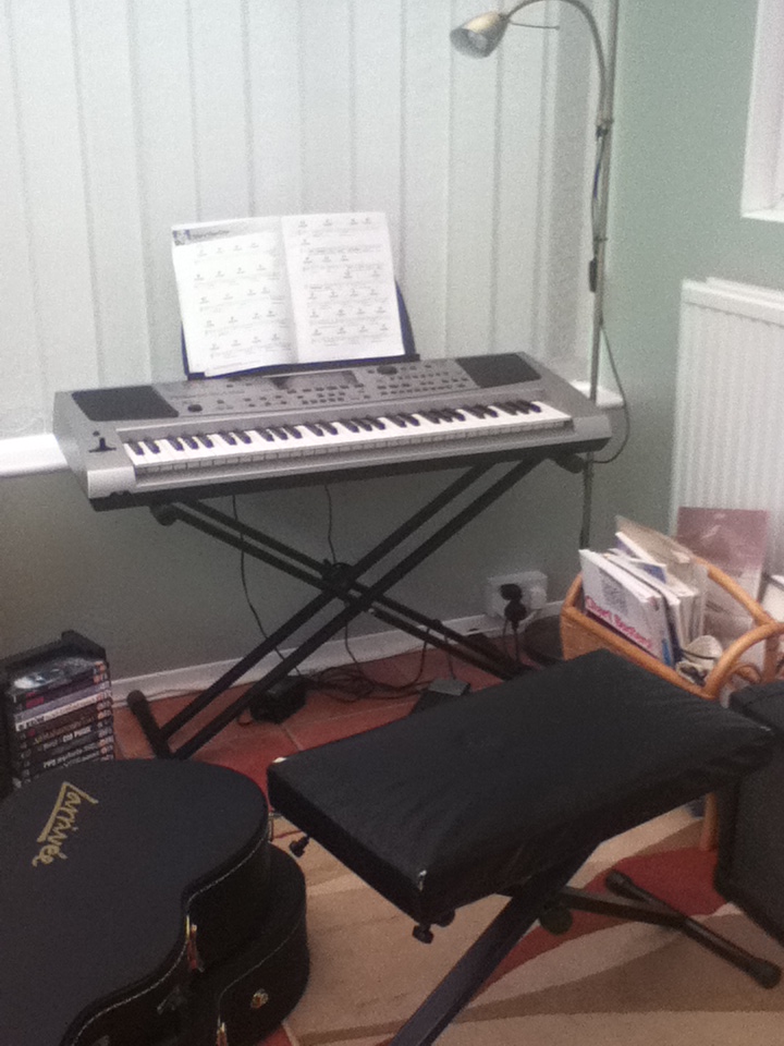
Guitar/keyboard: Setting Lily-Emma playing the keyboard or playing a guitar would show her as more of a musician. It would make her look more at home and it would create a more personal atmosphere with her. However, it may look too close to a home and it is not really a setting and is very busy and mis-match for my magazine.
Location THREE:
This will be the location for the simple picture used on the contents page of the fictional 'Isaac'. Because he is supposedly a school boy making his way into the music business he is going to be in quite a relaxed area but somewhere associated with people of his age.
 School library: Taking the picture in the school library would fit perfectly with the scene I want him to be in. It would be an ideal ideal to place him with school books to make him look like a school boy. The library is very bright and clean so it would be a good place to stage him working. However, because the photograph is going to be relatively small on the page, there is a lot of furniture in the library which could possibly overpower the model and not be very stand out. Also, for the target audience they would not be automatically attracted to a picture of a school in a music magazine. So it would be better to be something appealing to them.
  School field: The school field would once again, be an ideal setting for getting the age and situation of the character of 'Isaac' across. As he is the 'typical teenager' this is a place you would be more than likely to find him. However, the schoool is so big and plain there is nothing that would really distinguish him as being such a school student. It is such a big place that it would limit how he would be seen in this way.
Sofa: Having the model sitting on a sofa in the living room would create a very personal feel about him, which is something people would like to see in the magazine as it would be giving an insight into what could be seen as his home and people would be interested into what what it looks like. However, because it is just a small picture on the contents page this location would be quite busy as there is alot of room going on. This would be a more suitable location if I were to continue this article onto the double page spread.
Plain background: A plain background would probably be more suitable for this image. Because it is a smaller picture on the contents page it has to be clear who the subject is and what the article will be about. The costume colour will need to contrast against the background to make it bright and eye-catching for the audience.
No comments:
Post a Comment