Thursday 24 March 2011

Evaluation: Progression from preliminary task


Looking back at my preliminary task product, I feel that I have progressed a lot to my full product.
I have learnt a lot more along the way of conventions of magazines and the things that are done to make it attractive and appealing to the audience.
With regards to the front cover, looking back the image on my preliminary task is quite hidden underneath the coverlines. I have learn throughout that although there is need for a lot of coverlines (particularly to my target audience choice) that the image still needs to be the main thing on the page, as it is the thing people see first. I have also progressed by my use of a pull quote on the cover. By using this reader gets an insight into the article and ‘pulls in’ their interest to read it and purchase the magazine. On my preliminary task front cover I didn’t really have anything that revealing or interesting that would grab the audiences attention.

My final product appeals a lot more to a specific audience. Because the school magazine had to appeal to a wide range of ages I had to make it as neutral as possible so it would appeal to everyone. By identifying a clear target audience for my final product I was able to create a more appealing colour scheme, contents features and use mise-en-scene more effectively to appeal to them.
I also used a variety of fonts on my final product. With my preliminary task I used just one font which made the cover look very plain and not very appealing because nothing stands out. On my final cover I used different fonts to appeal to the audience effectively.
On the topic of Technologies, I have developed my skills in the use of different editing programmes and found that is more suitable to use a combination of many to achieve the best results for my product. With my preliminary task I used one programme to create my product, mostly having the same results for each element. However, for my full product I experimented with a wider range of programmes which all did different things to help my product in different ways. Photoscape is useful, but only for editing single photos. When I came to adding many different elements to my cover and double page spread I needed another programme that would cope with layering of text and other elements, particularly involving the house style and colour scheme.

Evaluation: Technologies

To produce my magazine I used a camera, computer, PhotoScape editing software, macromedia fireworks editing software and Microsoft Publisher. To take the three sets of photos I used a standard digital camera. I then uploaded them onto a computer and manipulated them accordingly using photoscape editing software. By using photoscape I was able to re-size the images whilst keeping the same quality, shape the images (for the contents page) and alter the brightness and contrast to improve the image appearance. To construct the main body of the product I used Microsoft publisher and this was the most accessible programme that can combine text, shapes and photographs.
I used my skills when taking the photographs. I made sure I was aware of the light position and how dark the areas were when I was taking the photographs because I needed all my photographs to be bright and bold. Once, I had taken the pictures I used PhotoScape editing software to edit them accordingly. I used auto-level and auto-contrast on all of my photos. For the double page spread image I inserted 3 objects (picture doodles) and re-sized them to fit in with page and layered them in the correct places. I also used the whole image re sizer to change the dimensions of the image but to also keep the same quality. For the front cover image I needed to remove the whole of the white background for the plans for my front cover. To do this I first edited the auto-level and auto-contrast on photoscape but then transferred the image to fireworks. Using the ‘magic-wand’ tool I was able to select the total area I wish to remove and keep a smooth edge on the image left. The only editing I used for the contents page image was to auto-level them and then make them have round edges. I did this all on photoscape.

Examples in my product:


< Image on photoscape- auto level and auto contrast

Photoscape editing software skills:Cropping the photo to square size (conventional album cover). The focus of the album cover is to be the figure herself, so ideally she should be centred in the middle of the cropped photograph. However, because this album cover is aimed at a young audience, they stereotypically have large text. Therefore I positioned the figure to the right hand side, leaving room for the large text to cover the top of the image.

< Image after cropping, and adding text (outline and shadowing)


In my preliminary task I used photoscape for the whole of my final product. I chose to use Microsoft Publisher for the main task because this gives you a lot of features that photoscape does not. For example, photoscape is mainly used for editing the whole of one photo rather than a ‘product’ with multiple elements of photographs, shapes and text- all layered on top of one and other. In my planning I made draft layouts of my final product which were in publisher. Continuing in publisher I added the edited photographs to these and then was able to add text, colours and shapes to the page.

Evaluation: Appeal to target audience

In the primary optical area are the date of the issue and the issue number, it is also the beginning of the masthead. These are the things that people want to see first, once they notice that it is a new issue and they then look for the date and number. The masthead is the first thing they look at and this follows the beginning of the route of the eye. It is the largest piece of text on the page. It is pink and blue layered to keep it bold and bright. Using fresh colours like these make the magazine look very modern and something the target market looks for, as identified in my research.
The coverlines appeal to the audience due to the artists they feature. From my audience research and then deciding on the target audience, I found out that they like these type of artists. So by including on the front cover they are likely to catch their eye and be picking up the product.
The colour scheme is a major way I appealed to my target audience. By using bright fresh colours as identified in my questionnaire they audience is immediately attracted to the magazine. It is quite a childish immature colour scheme, but this is ideal for the younger target audience. Also because the page is quite bus with a cluttered layout, using as many different combinations of the colours over and over and in blocks make it stand out and bright.
Along the route of the eye, it goes through the image on the cover. This is something very noticeable to the audience as it is one of the things that would make them pick up the magazine in the first place. Placing the image right in the middle of the page makes it the most prominent feature on the page.
Continuing with most magazine conventions they only use two or three fonts on the cover. I used a bolder different font for the main coverline and masthead- something that would be continued through the magazine, as the ‘house style’. And then used a simpler sans serif font for the rest of the coverlines, not to over complicate things for the audience. I used a lot of coverlines as this is something that attracts the audience as it makes the page busy.
In the terminal area are the barcode and the other magazine information, something that is not really read by the reader immediately, but is essential for a magazine. 

From my finished product research I asked specific questions for the cover. By doing this I could gage what they audience thought about certain aspects and how far they agreed with statements I through out. My questionnaire was once again placed onto my blog, my personal facebook and twitter pages to get the correct age of target market answering the questionnaire. Particular standout results are 100% of the answers agreeing with 'The colours used are eye-catching'. This is something very important to the appeal to the audience, especially on the cover, as it is the first thing people see. The high 'strongly agree' response shows that this convention worked and that it does appeal to the audience.

The contents page is the second thing the audience turn to when flicking through the magazine. I needed it to be clear and logical for readers who use it to navigate to certain features or for one off readers who are not familiar to the magazine layout.
To appeal to my audience I made sure I used a lot of household names in the content. In my research survey I found that they are quite picky on who they are reading about so I tried to use the most popular artists that the specific ‘pop’ listening audience know and what to read about.
In the primary optical area are the magazine masthead but smaller and the contact details. Along the route of the eye continues through the list of articles in the magazine. It then reaches a 'subscribe' box. This is something that is conventional to be advertised on the contents page.
Towards the end of the route of the eye is the page number. Something people still look at but not the most necessary element on the page.
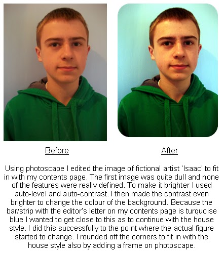
I added a editors letter to the page which makes it seem more realistic. The language used appeals to the audience as it is talking directly to them. I used words such as 'Have a wonderful week' and 'See you soon' to make it more personal to them and make it more interactive.
In my initial research I found out that there wasn't a clear answer for what type of layout they would like. There was a slight advantage for cluttered layout with lots of features. So to my audience's choice, I decided to keep my layout quite ordered in the principle of thirds. The first vertical third is the editor's letter, the second the first list of content and the third is the rest of the content. However, to keep it busier and appeal to the audience I continued the house style of using the bright colours. It is also clear horizontally for the principle of thirds, the first being the title of 'this week...', the masthead and contact details, the third being the main content and the last horizontal third being the lesser important content with the subscribe box.


The answers to my final product questionnaire once again mainly agreed with the statements I asked about. One that shows my magazine is appealing to the audience is the response to the content is suitable for me as a reader. I tried to carefully pick and construct the list of contents by researching artists, in my initial research survey, to see what appealed to them so they would want to read my magazine. The questionnaire highlighted the importance of the contents page, with all the responses agreeing with the fact it makes it easier to navigate through the magazine by using this page. It shows it was the correct reason to include this page, of opposed to when I analysed Top of the Pops magazine, as they did not include a contents page. One stand out result is the response to 'There is a balance between pictures and text' although it was all positive, there was majority just agree, which shows that maybe I could have added extra images to the contents page to break up the blocks of text more.

For the contents page I used a lot of different ways to appeal to the audience.
The main picture on the double page spread is a long shot of 'Lily-Emma' standing on a park bench. I wanted to represent her as a stereotypical teenage that the audience would warm to. By positioning her on the park bench makes her look very dominating. As the background is quite dull, with dull greens and browns, the bright red hoodie stands out. I also added extra pictures over the picture to make it more immature. By adding the drawn on cloud, butterfly and snail, makes it appeal to the younger teenagers because it looks like it have been drawn on or 'doodled' over like a notebook, something that they would be doing at their age and therefore be attracted to. At the end of the route of the eye is an album cover and an advertisement. This is something that conventionally would be in a magazine article as they are there to advertise their cd's. I placed this at the end of the route of the eye because it is the last thing the audience will see, so they will remember it.
On the first page of the double page spread I continued the house theme of the sticker like features. By using 'Downloads Lily-Emma Exclusive' it draws the audience in as it says it is 'exclusive' making them think that it is something that they will not read anywhere else.
With regards to appeal to the audience with the language I made sure the article with 'Lily-Emma' was quite personal. I also made it so it is written exactly like it is being spoken by her.
The colours appeal to the audience. By using the background colour as pink it stands out. If someone was to pick up the magazine and flick through it they would be attracted to the pink and the bold red on top of it because it stands out. The use of the red and pink also compliments the hoodie she is wearing and picks this out of the picture.


From creating another survey I found that majority of the people asked said the article was identified clearly and it was clear who the article was about. They also agreed with the statement that the article is similar to what would be read in a music magazine. This showed that my style of language and written article appealed to the music magazine readers. I also found that there was a good response to 'the colours and the style  the page fit in well together', although is was mixed between agree and strongly agree I showed that the carefully thought about combination of colour on the left hand page and the matching with the red hoodie go well together. 


Evaluation: Target audience

The target audience for my magazine is young teenagers aged 11-15 who are interested in pop music. I gathered this from my original target audience questionnaire, by determining their age and what things they look for in music magazines. I also decided this after doing institution research and finding that there isn’t really a magazine being published and distributed containing this type of music and appealing to such an audience. My target audience is primarily females, however there were some male answers to my survey and I still counted these as I could still open my magazine up to them and not limiting the audience.

http://rachelashby12.blogspot.com/2010/11/create-your-free-online-surveys-with.html

I posted my questionnaire onto my blog and also onto my personal facebook and twitter pages as I could get a larger amount of responses from it in the time I had to gather the responses. I had a mixed amount of responses, all falling between ages 9 and 19. I also had majority of female responses, but as previously stated, I still included these in my findings. I decided to limit my magazine audience to ages 11-15 as this is possibly the biggest gap in the market. There are already magazines aimed at the older age of this amount such as Top of the Pops and NME. Then for the younger ages there is nothing specific but Girl Talk could be included in this, although it is not based as a specific music

From my survey I also found out about the types of audience my now identified audience listen to. By asking questions such as ‘What genre of music do you listen to most?’ and ‘Who would you be more interested in reading an article about?’ I could gage who they are most interested in and what types of artists I should be including in my magazine. The top answers for these questions were Pop and Rock, with Pop having the majority. This told me this is the most popular music type being listened to by these type of people and it is the genre they would want to read about. I also found out that ‘Cheryl Cole’ and ‘The Killers’ were the most popular artists being listened to. This helped me as I could then decide what type of artist I should make my featured cover artist, due to the popularity of existing artists with my audience. Therefore the main artists I chose to include in my  magazine were one in the current UK Top 40, as these were to most popular artists identified and therefore including different artists like these would appeal to my audience.

Evaluation: Institutions

In my research I found analysed magazines similar to mine. Top of the Pops and NME magazine are both music magazines that feature similar popular music to my magazine. 
NME magazine is published and distributed by IPC media. They are owned by Time Inc, who are then owned by Time Warner. Time Warner are the worlds second largest entertainment conglomerate revenue wise and the worlds largest media conglomerate. IPC media is the UKs leading consumer magazine publisher, they produce over 85 magazines. Their magazines are read by almost 27 million UK adults, they also have online brands which reach 20 million monthly users. They focus on five core audiences: men, mass market women, upmarket women, leisure and specialist and television.
Examples of magazines that IPC publish and distribute are Country Life, Rugby Life, Womens Own, Whats on TV, Ideal Home and Look.
NME magazine features the same music as mine and includes the same music magazine conventions as I followed to produce my magazine. However, NME magazine is aimed at a slightly older audience than mine, it also possibly has more appeal to males and females, rather than mine to mostly females, but not eliminating the fact males could read it.
IPC media does not publish any other specific music magazines. They reach such a large amount of people that I think my magazine could be advertised accordingly, in the magazines aimed at mass market women and TV titles, that parents read and then could recommend my magazine to their younger tee children. IPC do not publish or distribute a magazine like mine, it is a market that they do not currently reach and that they could possibly do so- in distributing Download magazine.
I also found out about BBC magazines who produce Top of the Pops magazine. BBC magazines is a department of BBC worldwide, who are owned by the BBC. BBC magazines is the UK’s fourth largest magazine publisher, the third largest publisher in terms of revenue and the UK’s number one publisher for subscriptions. The produce over 50 popular consumer titles, which are all regular publications. BBC magazines is not just in the UK, it has 43 licensed editions of magazines in over 55 countries.

Examples of magazines BBC magazines produce are: Good Food, Gardeners World, Radio Times, Top Gear, Doctor Who and Girl Talk.
Top of the Pops magazine is very similar to my magazine in terms of content and target audience. They use identical conventions and ways of drawing the audience in. BBC magazines also publish and distribute Girl Talk. Girl Talk is the magazine aimed at girls and young teenagers. BBC magazine would be perfect in publishing and distributing my magazine as it reaches such a large mass audience. It would also be ideal because they are popular for subscriptions, which is what my magazine would continue to be, as a weekly issue. However, because they already publish Top of the Pops and Girl Talk, my Download magazine is pretty much these two magazines combined. Therefore I do not thing BBC magazines would be inclined to distribute my magazine under their name because they would be limiting the appeal to the two existing magazines. If they published and distributed Download, people would buy it and then no longer by the other two magazines, making loss of revenue from selling one magazine as opposed to two.

Evaluation: Representation

In my magazine I tried to use stereotypical representation of teenagers to make it appealing to the young teenage target market.
For the casting I used people of a similar age to my target market so they could relate to them as closely as possible. With regards to the main character used throughout my magazine I wanted to represent her through the images as a stereotypical teenage girl. I did this through the costume she was wearing. By putting her in the costume of a casual hoodie, jeans and boots this is something that the target audience would be wearing. From my research I found that when the audience are reading the magazines they wanted to closely relate to the artists featured, so by putting her in a costume that the audience would wear they wouldn’t feel too far away from the artist as it is something that they would wear themselves so they feel that they could dress up like their favourite artist. 
With the double page spread image I wanted to represent ‘Lily-Emma’ as a stereotypical teenage girl but with a sort of rebellious side to her that would appeal to the reader. By locating her in what looks like a quiet park and nice area shows her age but as she is situated standing on top of the bench this shows that she is fun and not the safe girly girl shown by her character and costume.          
The language used throughout the magazine is written as it is directly speaking to the reader. On the contents page for example the use of ‘This week we’ve gathered together some extra special features to help you get through a cold February with some sweet sounding music!’ is written like the target audience would say it. Younger teenagers are more likely to be drawn in with exciting language such as ‘sweet sounding music’ and ‘extra special’ as they are stimulating for the audience and they want to carry on to read the articles. By addressing the audience as ‘you’ it is directly speaking to them, making it more personal and involved.
The language in the article changes slightly as it is written exactly how Lily-Emma is answering the questions. A typical sentence from the article is ‘I love performing it and it makes you feel sooo good inside!’ I used the over-exaggeration of the ‘o’ on ‘sooo’ to express her feeling towards the sentence, so it is like she is speaking it. It also represents her age and they way people talk, appealing to that particular audience.
In the X-factor magazine contents page they do not use as many exclamation marks or bold words to make things stand out. From my research I found that this doesn’t make it as appealing as there is nothing to make it stand out or exaggerate any of the sentences. This may be due to the fact X-factor magazine is aimed at a slightly older audience than my magazine, so they want to keep it more ordered and professional. Throughout my article and contents page I used lots of exclamation marks which make it more exciting and enthusiastic to read for my younger target audience.
An example of speaking directly to the audience in X-factor magazine is ‘We also chatted to the Westlife boys about their comeback’. This is something I tried to do in my magazine so the reader feels more involved like ‘We’ did this for ‘you’, as it is more personal for them.

I used the same conventional ways that NME did when showing Lily Allen, although I was representing a different type of person. I used the costume to represent the stereotypical teenage girl to appeal to the teenage audience. Following the same way that NME magazine did using the stereotypical goth-like look on Lily Allen to appeal directly to the bulk of their target market. I also tried to include the fact that Lily Allen looks quite effortless and people could easily copy her style. As stated before, the costume Lily Emma is wearing could be easily be brought by the target audience, who often look through magazine because they want to copy their style and look like their favourite pop star.

Evaluation: Conventions

From my research I found out basic conventions that music magazines have. I found out that most front covers have a single model positioned in the centre of the page or to the right. They are sometimes positioned to the right so if they are layered on top of each other on shop shelves the coverlines and information are on the left so can still be seen. I incorporated this convention into my product by positioning the model directly in the middle of this page. This makes it very noticeable on the page and stands out creating an immediate connection with the audience.
In my research I found that the coverlines on the cover always tease the contents on the magazine, as they are the first thing people see- it will mostly decide whether they are going to purchase the magazine or not. They are short and snappy and catch people's eyes as they involve highly known pop stars that the target audience want to read about. In my magazine I used short coverlines so I could take up as less room per coverline and put as many as possible on the page, to make it busy. I used high profile names such as what ‘Lily-Emma’ would be is she was real and also Bruno Mars, Ellie Goulding and the fictional ‘Isaac’. I accompanied the ‘Lily-Emma’ name with a quote from the article similar to the X-factor magazines –Katie “I’m not ready to give in yet”. A short quote from the main article makes people want to read it and draws in the audience to the article as they want to see the whole story.
From the research from typical teen magazines such as ‘Smash Hits’ and ‘X-factor magazine’ I found that they tend to have a bright colour scheme to make it appeal to the specific target market. Teen magazines involve colours such as bright yellows, pinks and blues as they appeal specifically to the age range. For my magazine I used a clear colour scheme which I continued to the contents page, this created a brand identity for my magazine and a house style. By using the combination of the blue, purple and pink it appeals to the young teen target market. I know this as it had be particularly identified from the focus group and the existing magazines.
For customer convenience all music magazine feature the constant price, bar code and issue number. I continued the use of these on my magazine to make it look more professional and included all the smaller features such as these that magazine would have conventionally.
Contents pages specifically with regards to the X-factor magazine involve not just quotes and text but pictures to accompany the text and break up the contents page. I used a second picture from the set of pictures taken for the double-page spread, to show the original pictures, it is clearly from the same set of pictures as the model is wearing the same outfit and it is more or less in the same location but in a different area in a different pose to continue to the double-page spread article.
With the three magazines I looked at they all include external advertisements on the contents page, mostly for subscriptions as such a small advertisement wouldn’t really fit in on any other page. To use this convention I included a subscription advert but made it look not too out of place and included it with the house style.
On the contents pages I looked at there was a small piece of text in the corner of one of the pages of the double page spread which shows the artists name. This is generally used for the one off reader to negotiate their way through the magazine. I used this convention within my magazine with the text ‘Lily-Emma’ in the top right hand corner. This is useful for one off readers who are not familiar with the format of the magazine to find the article they are looking for.
I was also aware of the use of fonts in my magazine. For the cover and contents page I continued the use of the same fonts to create the house style and the brand identity which would be used every issue. On the double page spread I used different fonts that went well with the colour scheme of red and I was still careful to make them readable. By using different fonts is made a difference to the magazine and identified it as an individual article. I researched a large number of fonts before adapting my final choice. By looking at all the fonts I looked for something that was clear and easy to read. I also wanted something that would be eye catching but simple to appeal to my target market.

< Final combination of colours and font I chose. Making sure it was readable and appealing colours for the target market. It looks bright and fresh which I would be able to continue through my magazine.

 I chose not to use the same colour scheme on the double page spread as I used with the cover and contents page. This makes the page stand out compared to the rest of the articles. Although it does not have the same colour scheme the same house style is continued with the sticker like circle in the top corner and the page numbering. This keeps the magazine familiar but also distinguishes it from the rest of the magazine. As with the other double page spreads I analysed I found that the introductory paragraphs to the articles are put in a larger font or bolder compared to the rest of the article. This breaks up the article and shows a clear introduction to the article.